Pastel palettes can feel like a soft exhale. When a game uses gentle colors, your eyes work less, your attention settles faster, and the whole experience can feel mentally lighter.
This is where pastel palettes cognitive load becomes more than an aesthetic trend. It becomes a quiet support for the mind: reducing visual strain, improving clarity, and helping players remain in a calm, focused state without realizing why.
In this article, we explore why softer color choices can lower mental effort, how they support cozy game comfort, and how calm visuals can remain clear and readable at the same time.
While this article focuses on how pastel palettes reduce cognitive load and mental effort, color choices also work on an emotional level. If you want to explore how specific hues influence mood, comfort, and emotional safety in cozy games, you may enjoy our companion article on color psychology in cozy games.
Soft colors and simple shapes make the interface feel easier to breathe in.
Table of Contents
1) What “cognitive load” feels like in game visuals
Cognitive load is the subtle effort your mind makes to understand what it is seeing and decide where to rest its attention. In games, this effort appears in small moments: reading text, scanning a scene, noticing what matters, or choosing what to do next.
When visuals feel loud—through harsh contrast, intense colors, or crowded details—the mind must constantly filter signal from noise. When visuals are calmer, attention can relax. More mental space becomes available for immersion, story, and that familiar cozy sense of ease.
2) How pastel palettes cognitive load becomes lighter through visual simplicity
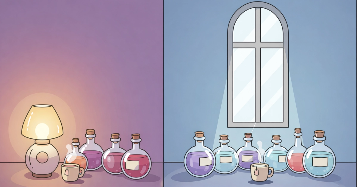
Pastel palettes usually rely on softer saturation and gentler contrast. To the eye, this creates fewer visual shocks and a smoother flow across the screen.
The effect is not dramatic, but it is meaningful. Important elements feel easier to notice, backgrounds feel less demanding, and your gaze can move without friction. The screen stops asking for effort and starts offering quiet guidance.
Research on color and perception also links strong saturation and contrast to visual fatigue and discomfort, especially in dense scenes. Softer palettes help avoid that sense of overload and support longer, more comfortable play sessions. You can explore one open-access example here: external psychology resource on color, perception, and visual fatigue.
Less intensity means less mental sorting.
3) Pastel palettes, attention, and the “safe background” effect
Your attention is always choosing where to settle. When backgrounds feel visually aggressive, they compete for focus. When backgrounds are soft, they quietly step back.
This creates a sense of visual safety. The mind learns that it does not need to stay alert everywhere at once. Main actions feel naturally highlighted, while everything else becomes a calm, supportive layer.
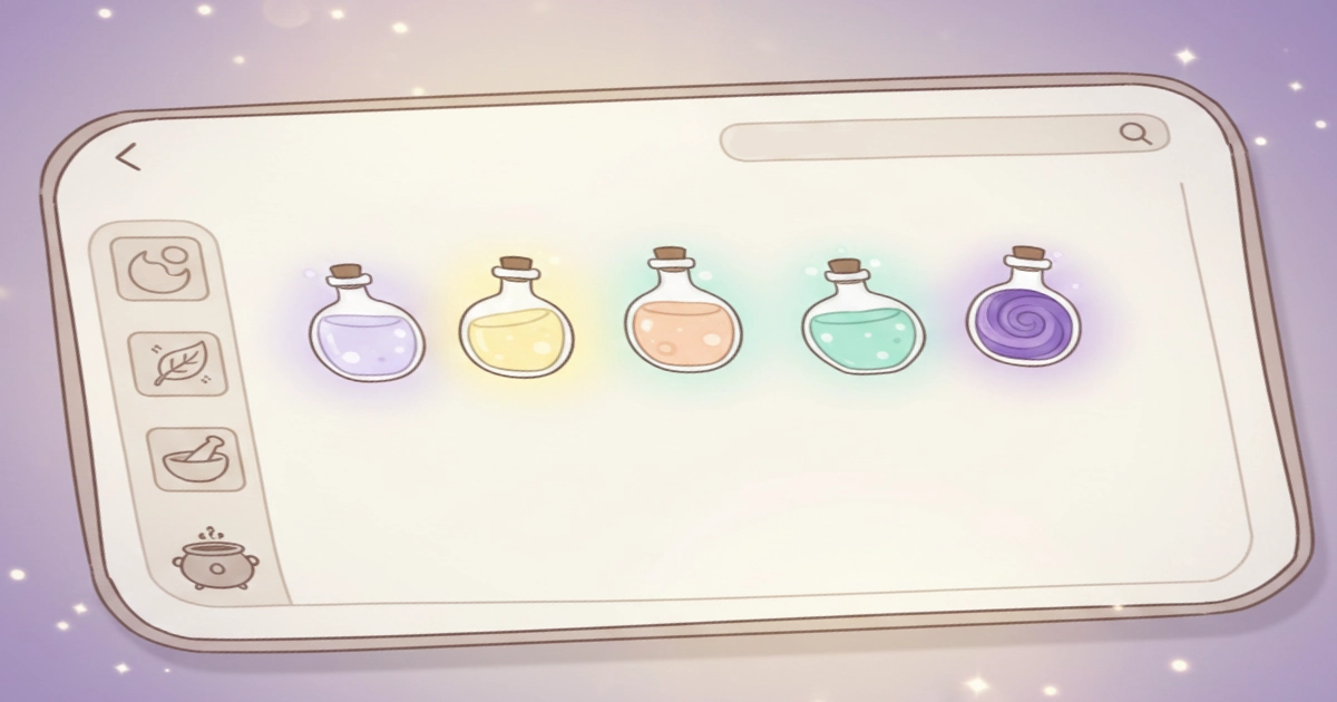
This is one reason cozy games often feel mentally soothing. They reduce constant alertness. Pastel palettes support this by making non-critical surfaces quieter, so your eyes can rest on what feels meaningful—crafting, arranging, collecting, decorating.
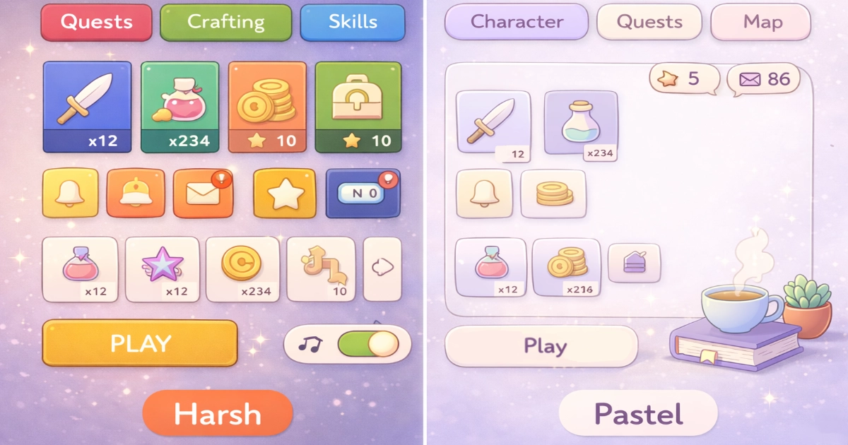
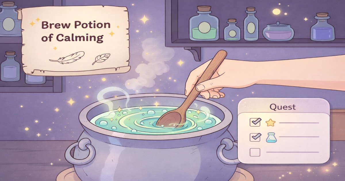
In Potion Game terms, it is the difference between “everything is shouting” and “the workbench is gently guiding.” If you enjoy this kind of reflection, you might also like How Gentle Soundscapes Reduce Anxiety in Cozy Games as a companion piece.
A soft background helps the main action feel obvious and easy.
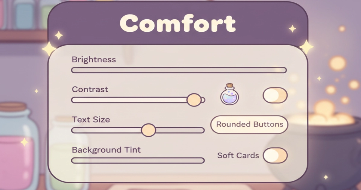
4) The readability trap: pastel does not mean unclear
Calm visuals still need to feel readable. Soft colors can reduce strain, but when text or symbols blend too much into the background, the mind has to work harder again—squinting, double-checking, and searching.
A cozy visual approach is not “washed out.” It is gentle but legible. Backgrounds can remain soft while important information feels grounded and steady, giving the eyes something reliable to rest on.
Accessibility guidance helps protect this balance. Contrast recommendations exist to ensure that calm does not turn into confusion, and that comfort remains inclusive for many kinds of viewers. You can read more here: W3C guidance on contrast (minimum).
5) When pastel palettes truly support digital calm
Pastel palettes feel most calming when the screen feels predictable and easy to read at a glance. Instead of overwhelming the eye with variety, they create a gentle rhythm the mind can trust.
Small, consistent patterns help reduce mental effort: familiar spacing, recurring shapes, and restrained highlights all contribute to a sense of quiet order. Nothing demands attention. Everything feels where it should be.
Researchers often describe this experience through perceived mental workload. Tools like NASA’s TLX exist to capture how heavy or light an experience feels to the user, reminding us that calm is not just visual—it is psychological. You can explore the reference here: NASA technical brief on cognitive workload and NASA-TLX.
Final Thoughts
Pastel palettes are not “just cute.” When they feel balanced and readable, they reduce visual friction and support a calmer, more spacious way of paying attention. Less mental sorting. Less tension. More room to enjoy the moment.
That is the quiet strength of cozy visual design: it does not demand focus—it gently invites it.
If you want more science-backed cozy design ideas, explore our Game Design Psychology articles, and if you want to inhabit a calmer, ritual-driven world with us, join the waitlist for Potion Game.
Want to be part of a new cozy alchemy adventure?
Join the Potion Game waitlist 💛