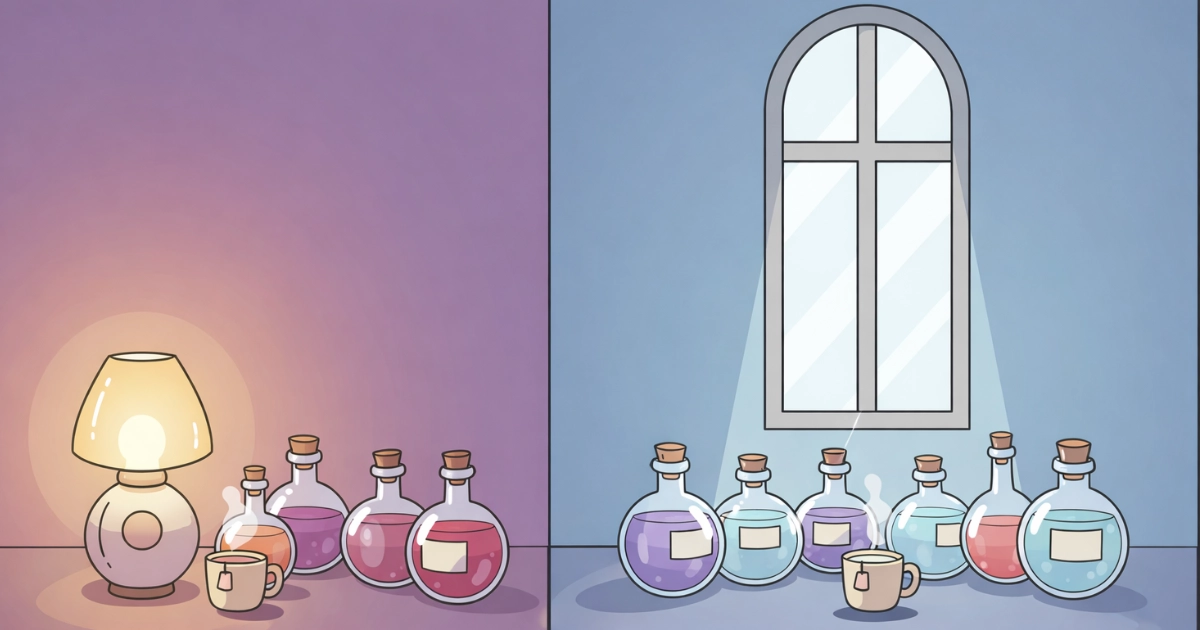
Low contrast design can feel like turning down a harsh spotlight. Instead of bright text punching through a dark background, the interface becomes softer, steadier, and easier to stay with for longer sessions.
For visual-sensitive players and anyone who gets eye strain, comfort is not “extra.” It is part of usability. In this article, we will explore why low contrast can reduce visual stress, when it helps, when it backfires, and how to design it in a way that stays readable.
We will also connect this idea to cozy game UI, where the goal is often a calm, low-pressure mood that supports focus without fatigue.
A softer interface can feel like a quieter room for your eyes.
Table of Contents
1) Visual stress: what your eyes are fighting on screens
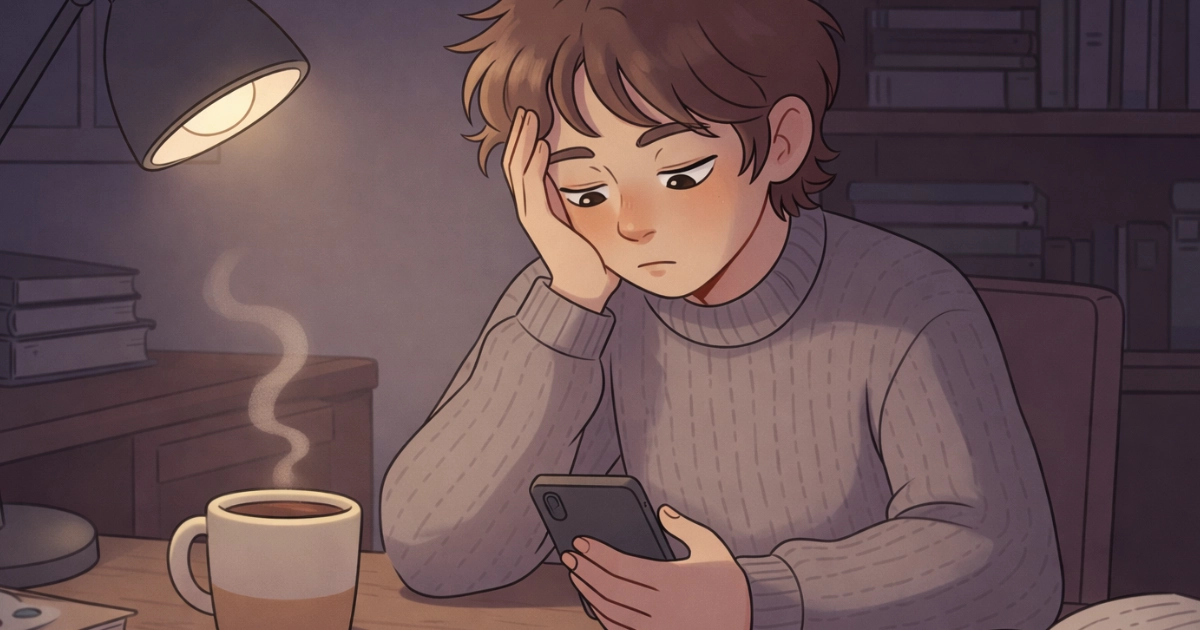
Visual stress is not just “tired eyes.” It is the strain that builds when your visual system must constantly work against glare, extreme brightness differences, tiny details, or flicker-like patterns.
Strong contrast can be useful for readability, but when it is paired with very bright whites, pure blacks, and sharp edges, it can create a sensation of “visual buzzing.” For some people, that can mean faster fatigue, headaches, or a feeling of being overwhelmed.
2) How low contrast design can feel calmer (and why it works)
Low contrast design reduces the intensity of foreground-background separation. That often means fewer “hard transitions” for the eyes to track, especially in bright environments or during long sessions.
In practical terms, low contrast can lower perceived glare and soften the boundary lines that demand attention. That can help the interface feel more like a gentle surface and less like a flashing sign.
Research and clinical discussions around digital eye strain commonly point to factors like glare, brightness mismatch, and display settings as contributors to discomfort. Reviews on digital eye strain also discuss comfort-related display adjustments, including contrast and brightness tuning as part of broader strategies to reduce symptoms.
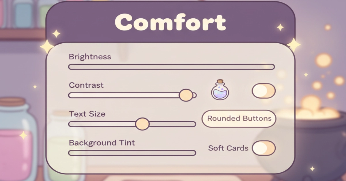
Comfort often comes from small, adjustable choices.
3) The readability paradox: low contrast can help stress, but harm clarity
Here is the key truth: low contrast design is not automatically accessible. If contrast drops too far, people with low vision, color-vision differences, or tired eyes may struggle to read, and that can increase stress instead of reducing it.
Accessibility guidelines exist because many users need sufficient contrast for text to be reliably readable. WCAG success criteria for text contrast set minimum contrast ratios for body text and define exceptions for large text and incidental content. That guidance is a helpful anchor when you want calm visuals without sacrificing legibility.
So the goal is not “lowest contrast possible.” The goal is “soft contrast where it is safe, strong contrast where it is needed.” Think of it like cooking: gentle heat for steeping tea, higher heat only when the recipe truly requires it.
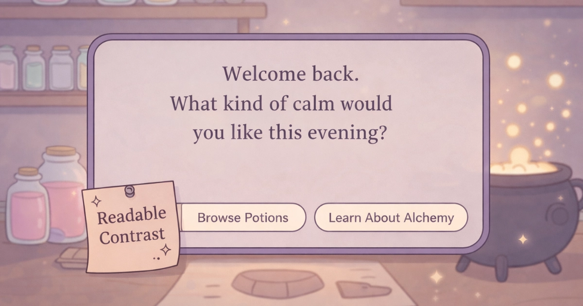
Soft contrast can still be clear when structure does the work.
4) Where low contrast design fits best in cozy UI
Low contrast design shines when the interface is not trying to shout. Cozy games often benefit from “quiet UI,” where the world and the player’s hands feel like the main focus.
These are common places where softer contrast works well:
- Background surfaces: panels, cards, and decorative frames can be low contrast so they do not compete with gameplay.
- Secondary text: hints, flavor text, and gentle tooltips can be softer if they are not critical for success.
- Idle states: buttons and icons can be calm until the player touches or focuses them.
- Ambient UI: meters and counters can be subtle, then brighten on interaction.
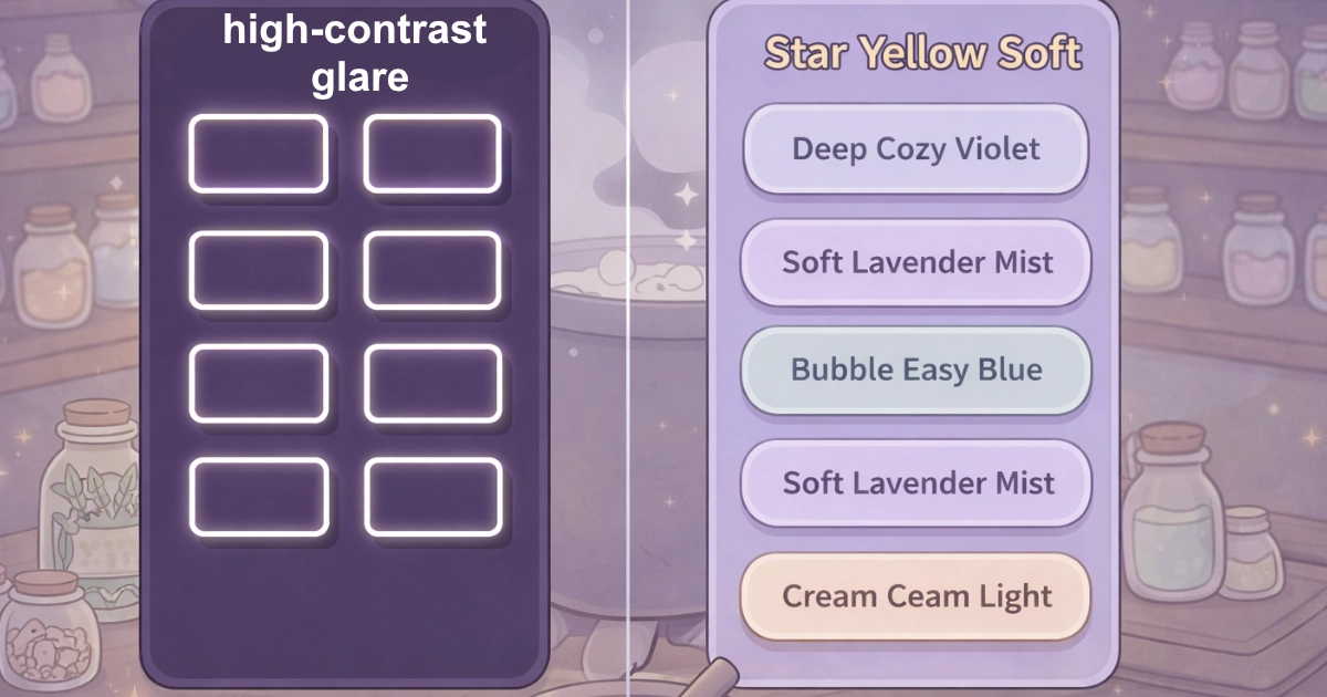
- Comfort modes: optional “soft UI” presets can support sensitive players without forcing one look on everyone.
If you want a broader design-psychology view of calm visuals, you may also enjoy
Attention Fatigue: Why Slow Games Are Better for the Mind, which explores how reduced visual urgency helps the brain recover.
5) Practical rules for low contrast design that still feels readable
When low contrast works, it usually works because structure is doing the heavy lifting. That means spacing, hierarchy, and interaction states carry clarity, not harsh color jumps.
Try these gentle rules:
- Use low contrast for surfaces, not for critical text: keep body text comfortably readable, and soften the panels behind it.
- Increase font size and line spacing: readability is not only contrast. Scale is comfort.
- Reserve stronger contrast for “must not miss” moments: errors, confirmations, timers, and important labels deserve clarity.
- Use hover/press states to add contrast only when needed: calm by default, clear on action.
- Avoid pure white on pure black: extreme pairs can feel harsh; softer off-whites and softened darks often feel gentler.
- Offer a high-contrast mode: comfort should include choice, because not all eyes want the same softness.
For an authoritative baseline on readable contrast, WCAG guidance on minimum text contrast is a useful reference: Understanding WCAG Contrast (Minimum).
And if you want a broader health-oriented overview of screen-related discomfort and practical habits, this comprehensive review on digital eye strain is a solid starting point: Digital Eye Strain: A Comprehensive Review (open access).
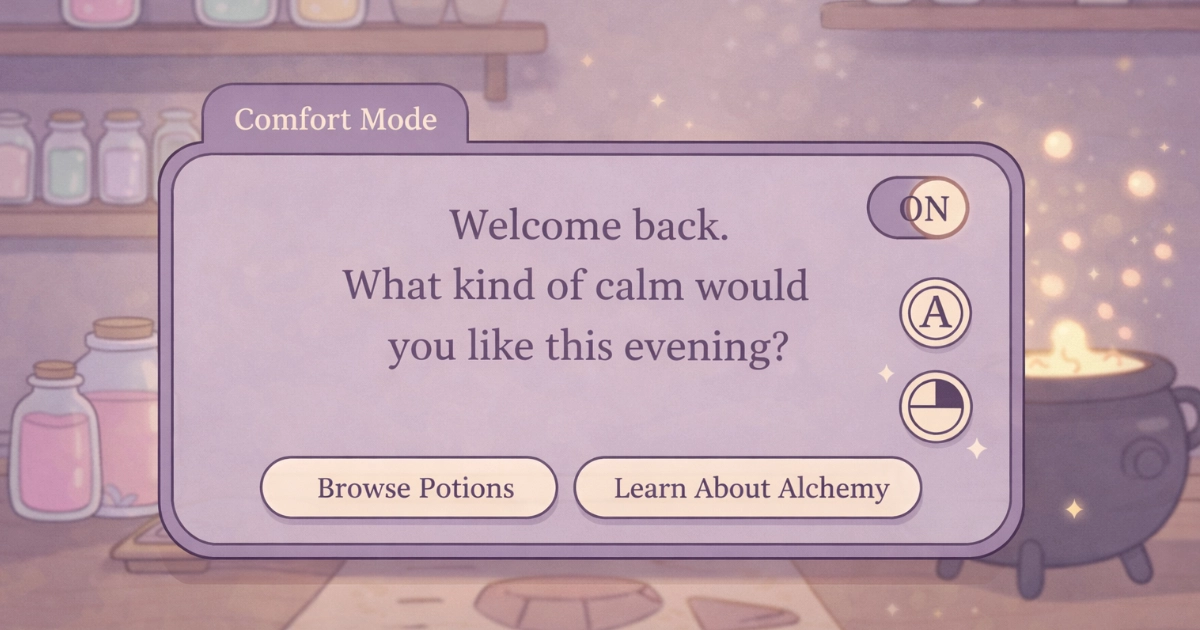
A comfort toggle is a small kindness that can change the whole session.
Final Thoughts
Low contrast design can reduce visual stress when it is used with care: soft surfaces, calm hierarchy, and clarity that appears exactly when the player needs it. The best cozy interfaces feel like they are helping, not demanding.
If you are building a calm game experience, consider pairing low-contrast choices with other gentle design tools like predictable layouts and soothing color palettes. You can also explore How Cozy Games Support Mental Wellness in Young Adults for a wider view of how calm design supports emotional comfort.
And if you want to experience a cozy alchemy UI built around gentle clarity, you can join the waitlist for Potion Game. We would love to welcome you into the shop.
Want to be part of a new cozy alchemy adventure?
Join the Potion Game waitlist 💛