When people say a scene feels “cozy,” lighting is usually doing more work than we realize. The keyword warm light cozy captures a familiar feeling: amber, gentle light often feels safer, calmer, and more welcoming than crisp blue-white light.
But the story is not simply “warm equals cozy, cool equals harsh.” In games, digital spaces, and everyday screens, context matters just as much as color temperature.
Let’s gently compare warm and cool lighting through simple psychology, and see how this understanding shapes cozy games and calming digital spaces.
The same space can feel completely different depending on light temperature and softness.
Table of Contents
1) Warm vs cool light: what it feels like
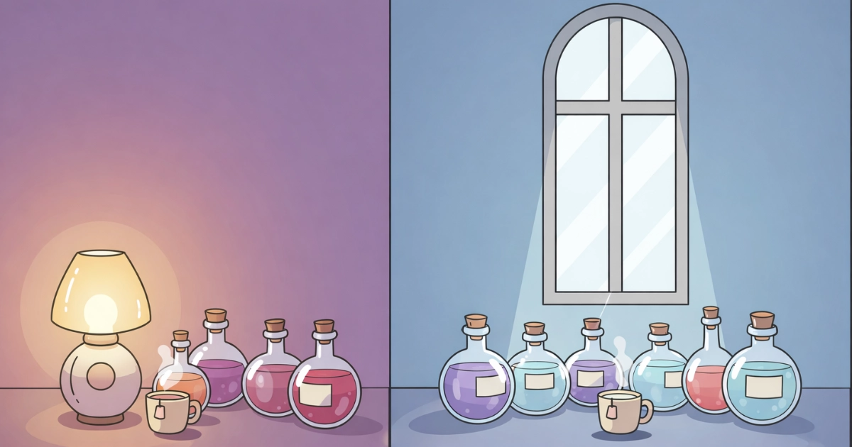
Warm and cool light usually describe color temperature. Warm light has a golden or amber tone, while cool light appears more blue-white.
Our brains instinctively connect these tones to different moments of the day. Warm light echoes sunsets, candles, and firelight. Cool light feels closer to daylight, overcast skies, or bright indoor spaces.
These associations are not technical—they are emotional. They quietly shape how safe, alert, or relaxed a space feels before we consciously notice anything else.
2) Why warm light cozy environments often feel safer
Warm light feels cozy largely because it aligns with how the body expects light to behave during rest. In the evening, softer and warmer tones signal shelter, slowdown, and safety.
This expectation can reduce visual tension. The eyes relax. The mind stops scanning for urgency. Everything feels a little more forgiving.
Cool, blue-enriched light is more commonly associated with daytime activity and alertness. That does not make it bad—but it can feel less like rest and more like effort.
A helpful mental image is this: warm light suggests rest, shelter, and a slower rhythm. That is why warm light cozy scenes appear so often in relaxing games, cottage interiors, cafés, and bedtime-friendly digital themes.
For a clear overview of how light timing and type relate to sleep and natural rhythms, this resource is a helpful starting point: Sleep Foundation: Light and Sleep.
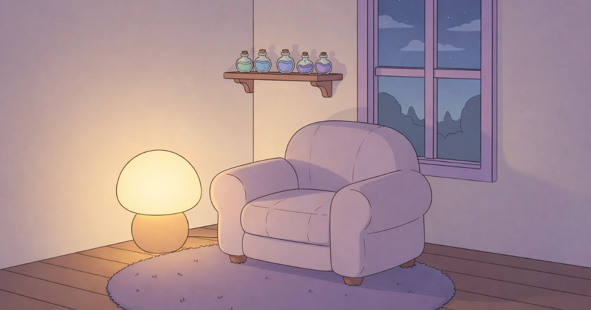
Warm light creates a soft, reassuring landing for the eyes.
3) Cool light can feel cozy too (when it supports calm and clarity)
Cool light is not automatically sterile. It can feel cozy when it is soft, diffused, and low-contrast, especially in scenes that suggest morning air, snowfall, moonlight, or gentle rain.
In digital spaces, cooler light can also feel calming when it improves clarity. Clean edges and neutral tones can make text and symbols easier to read, which quietly lowers mental effort.
The discomfort people often associate with cool light usually comes from excessive brightness, glare, or sharp contrast—not from cool tones themselves.
If you want more background on why blue-heavy light can feel stimulating at night, this overview provides useful context: Harvard Health: Blue light has a dark side.

Cool light can feel cozy when it stays soft and balanced with warmth.
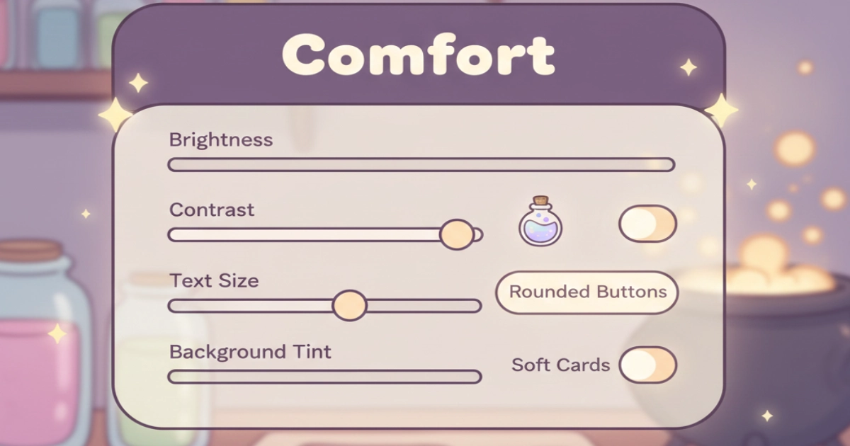
4) What matters more than temperature: brightness, contrast, and softness
Many lighting discussions overlook the most important factor: how intense the light feels. A warm scene can feel stressful if it is too bright or high-contrast. A cool scene can feel soothing if it is dimmer, consistent, and gentle.
In cozy games, comfort often comes from predictability. Stable brightness, smooth gradients, and the absence of sudden glare help the eyes feel safe.
Soft shadows and rounded highlights further reduce visual sharpness, making the experience feel calmer and less demanding.
If this idea resonates, you may enjoy our article on visual calm in interface design: How Pastel Palettes Reduce Cognitive Load in Games.
This topic also connects naturally with shape comfort, explored here: Rounded Shapes Psychology: Why Curves Feel Safer.
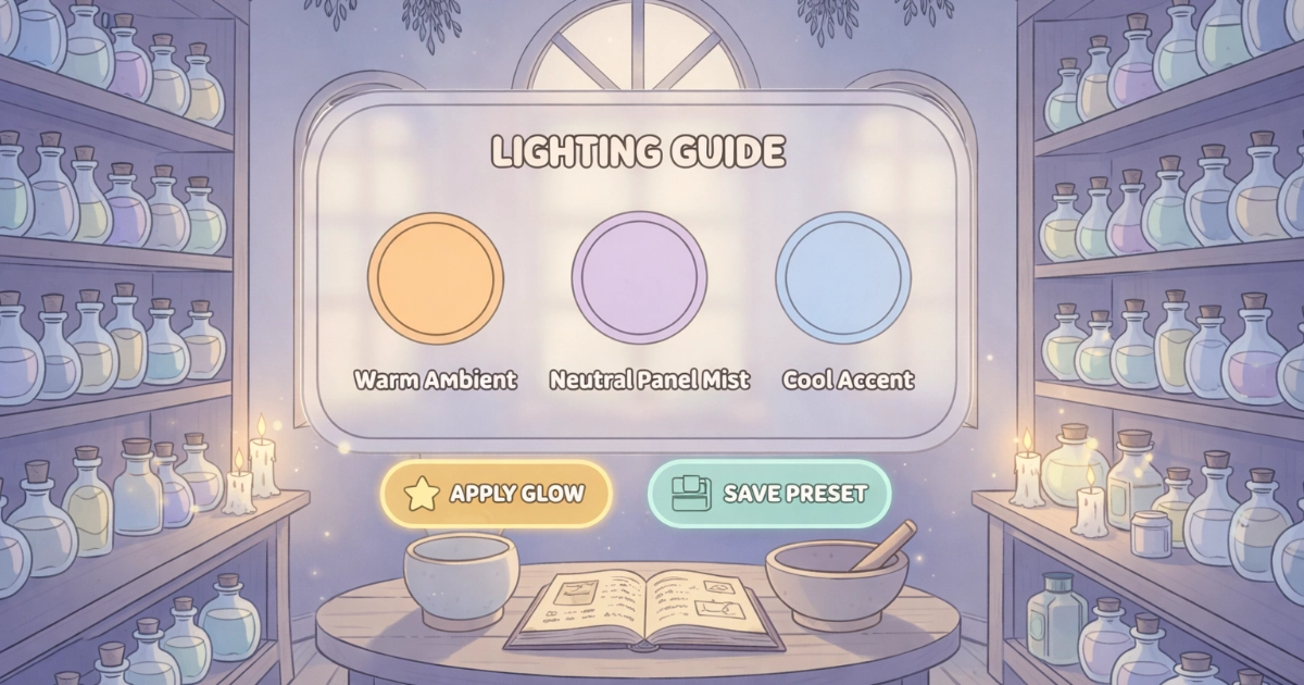
5) Gentle warm light cozy guidelines for digital spaces
If the goal is cozy without confusion, warm light works best as an emotional base, supported by clear visual structure. The most comforting spaces feel balanced rather than extreme.
- Use warmth for atmosphere: let warm light set the mood, especially in backgrounds.
- Protect clarity: keep reading areas visually steady and easy on the eyes.
- Soften highlights: avoid harsh white glare in favor of gentle, creamy light.
- Balance contrast: strong contrast where information matters, softer contrast elsewhere.
- Create safe anchors: lamps, windows, candles, or gentle glows help the eye settle.
- Match light to the moment: warmer tones feel natural for rest, cooler tones for quiet focus.
In short, warm light cozy is a reliable foundation—but true comfort comes from balance, consistency, and visual kindness.
Warm ambient light paired with clear contrast creates a calm visual rhythm.
Final Thoughts
Warm light often feels cozier because it aligns with the body’s natural expectations of rest and reduces the feeling of constant alertness. Cool light can still feel cozy when it remains soft, controlled, and supportive rather than sharp.
If you are shaping a calming crafting experience, think of lighting as a gentle soundtrack for the eyes—steady, warm, and easy to follow. For more cozy design psychology and visual comfort insights, you can join the Potion Game waitlist and follow the blog for upcoming guides.
Want to be part of a new cozy alchemy adventure?
Join the Potion Game waitlist 💛